Roger works with us in production as a Senior Artworker. He is talented and experienced in the trade and the addition of book work has been an exciting development for him.
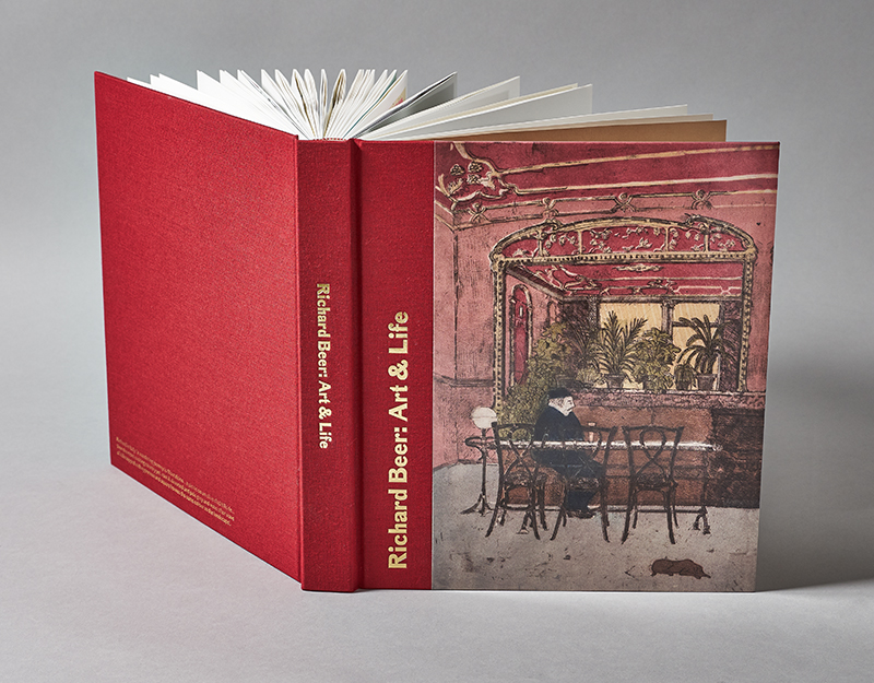
This book ‘Art & Life’ was very personal to Hurtwood as it documents the life and work of artist and family friend Richard (Dick) Beer. Born in 1928, Dick studied first Stage Design at the Slade before switching to painting and then print making in Paris in the 50s. He died in 2017 without family, but awash with friends. It was those friends, led by Jenifer Opie, who curated and edited this lovely limited edition of the work Dick left behind, ranging from stage sets for the Royal Opera House to book jackets, prints, posters, paintings and sketch books. The book was privately published by Dick’s friends and proved so popular it sold out within a few weeks.
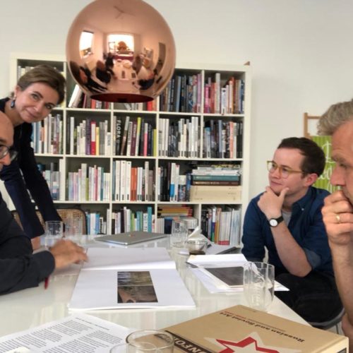
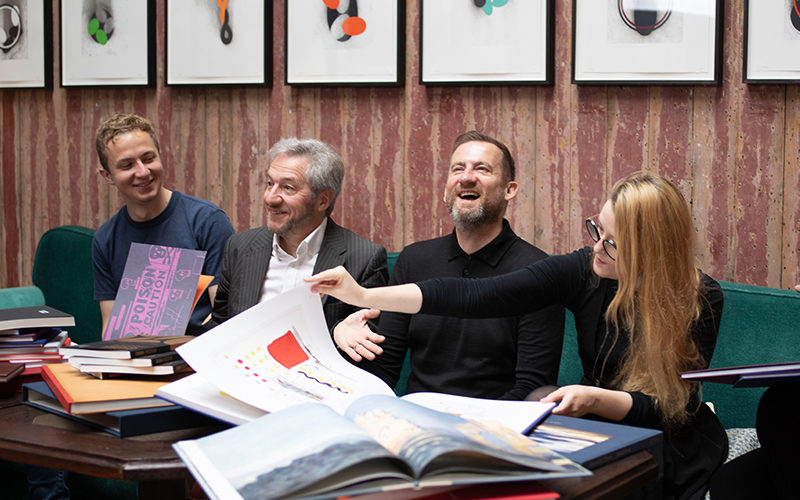
Roger said: “I loved working on this from day one when Jennifer arrived with a folder full of pictures and the idea of creating a tribute to Richard. Billie [the designer] had come up with a lovely design making the most of the vintage images and prints and really bringing out the fun side of Richard’s life, both in his work and with his friends. We took a great deal of care scanning and restoring the images, enhancing the vintage photos and posters and artworking the finished design. It was a full hands on project, but seeing the first finished book arrive at Hurtwood made me feel proud to be part of a fitting tribute to the life of a gifted artist”.
Paul is our Production Assistant, he is learning the skills of artworking and pre-press production and has a keen eye for colour.
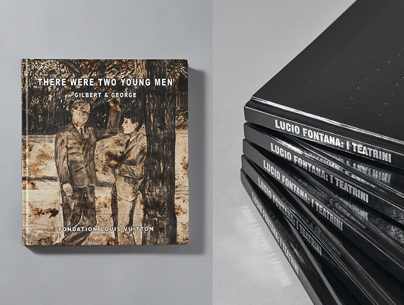
Produced for Fondation Louis Vuitton, this book accompanied the exhibition in Paris. These early charcoal sketches were being shown for the first time since being stolen in Italy in 1971. Gilbert & George had transparencies of the work and were certain that these were colour accurate, but something felt wrong. The paper looked green. Chatting it over in a pre-production meeting they told us they had ‘aged’ the paper with Potassium Permanganate, but Francis remembered his mother telling him that, during the early days of WWII, she used Potassium Permanganate to dye her legs as if she were wearing stockings! So we thought it was probably red/brown, not green. We insisted on looking at the originals in store in Paris and, with only two weeks to go before the show, discovered we were right. Beautiful paper and finally, accurate colour. Perfect.
Paul said: ”For me this was my favourite book as it’s a job where I had been given a specific and significant responsibility – seeing the originals in Paris and matching the colour to the images of the book. The originals had been made with Potassium Permanganate as a method of ageing the paper. The results of this differed from our supplied images, which had more of a green hue; yet the originals were almost brown in colour. Given that the difference was so great, it was imperative that I remember exactly how the originals looked, so I could go back to London and get to work on matching them (I was only allowed to see them the one time in Paris). From there it was over to Milan to work with the printers at Galli Thierry to get things right on the day, which I think we achieved together, very well. The best part of this job was receiving a phone call from Gilbert & George themselves to let us know how immensely happy they were with the book, and particularly how their work looked and felt just how they remembered the originals”.
Our book designer Billie is also an artist with a background in fine art. Billie designs from her heart with a deep understanding of the artworks and how to present them sympathetically in a book.
This book was designed as a unique high quality catalogue for Nahmad Projects to accompany their Exhibition of Fontana’s ‘Teatrini’ – an exclusive exhibition of eleven unseen works and five paper studies which were shown earlier this year.
Billie said: “I wanted to design an object that reflected the exhibited works, the era in which they were created and paid homage Fontana’s ‘Spatial Concepts’. The cover is a physical interpretation of a *Teatrini – using paper, foil blocking and blind debossing to create depth and texture with black edge painting to mimic the way the frames of the Teatrini work. Creating an object that feels ‘total’, a little surreal and like it might have dropped out of the vortex of space. The layout of the book is a modern, minimal interpretation of mid-century modern, using white space to create tension and rhythm and picking out the puncture marks as a motif to create detail and narrative within the text. The puncture marks were also of thematic importance to Nahmad Projects as part of Fontana’s interest in early space exploration”.
*’Teatrini’ means ‘little theatres’ and describes the last body of work created by Fontana before he died. The paintings are a mix of layers of cutaway canvases, and are aptly named. You can see the paintings here – on the Nahmad Projects site. Read more on the artist from Nahmad Projects|London
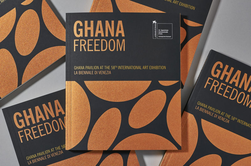
The first ever Ghana Pavilion at La Biennale di Venezia 2019 was extraordinarily beautiful. The pavilion was a vibrant mix of paintings, photographs, films, sculptures and installation celebrating the history of the country through its many Ghana based artists. We were thrilled to be asked to produce the beautiful catalogue to accompany the exhibition.
The book was designed in the New York, managed by Adjaye Associates in London, published in Germany and paid for in Ghana. We sit in the middle as usual. We found a great paper for the text (as thick as 170g, but only 120g) and helped the designer create a pagination that made the best and most economical use of colour. But most of all, what a fantastic cover! (see more of it here). It was designed by David Adjaye but the implementation of his concept was all ours. A super black paper (there’s nothing blacker) and the two iridescent metallic inks that move between shades of Gold and Copper – never the same and always distinct and different. Metals that reflect the main exports from Ghana.
Francis commented: “Having the idea and making it work. Lovely”.
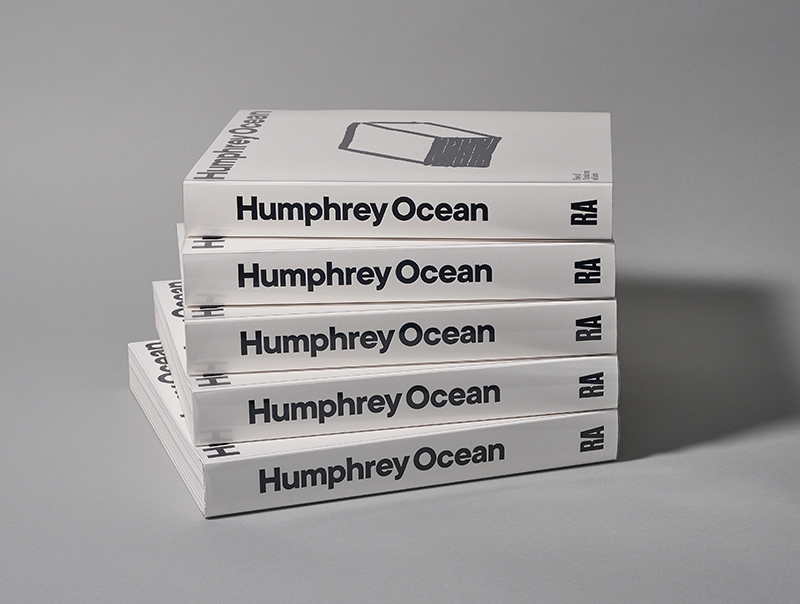
This book was on everyones list of favourites, the whole production team (all three of them!) had a hand in this monograph for the artist Humphrey Ocean RA, and we can honestly say it is one of the most satisfying and beautiful books we’ve worked on. Spanning Humphrey’s work over five decades it is now almost sold out at the Royal Academy in London. We worked with Humphrey and his design team and planned the book from scratch. From recommending the paper it’s printed on through to choosing the bindery to bind it, as well as undertaking all the pre-press and colour reproduction. Following the book on its production journey Francis accompanied Humphrey to check the pages on press while Roger went to check the book being bound and finished at the bindery – the last stop in its epic travels. Humphrey’s use of seemingly simple and similar shades of colour made for an exciting challenge in reproducing the pictures as accurately as is possible. The book shows highlights of Humphrey’s work, from portraits to sculpture, old photographs and sketchbooks. See more here.
And the last word from Roger: “It was worth every minute to see the smile on Humphrey’s face when he came in to see the finished book”.
PS
And to top it all our year culminated in another win at the British Book Design & Production awards; this time in the Art & Architectural Monograph category. We may be small, but we are mighty!
See the winning book and explore more images of all the above books in our portfolio.