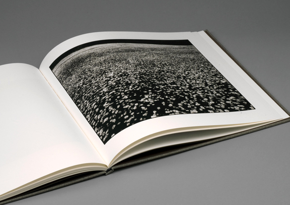
Platinum prints, also called platinotypes, are photographic prints made by a monochrome printing process involving platinum. Tones range from warm black, to reddish brown, with expanded mid-tone greys that are difficult, if not impossible, to obtain in traditional silver prints.
I first encountered platinum prints when I worked at Salto in Belgium. Unlike ‘normal’, silver bromide printing, platinum salts are used to print black and white photographs in the deepest of blacks and with the eternal permanence of platinum.
In black and white photography, the quality of the picture depends entirely on the depth of black that can be achieved as, the deeper the black, the more shades of grey that can live between black and white: and the more shades of grey, the more detail and interest you can bring to life. Simple really.
Unfortunately, achieving really dense blacks in offset-litho printing is anything but simple. Offset lithography inks are transparent (most people imagine ink to be opaque, but it’s their transparency that allows multiple colours to be obtained from the mixing of cyan, magenta, yellow and black) so there is a limit to the density of black that can be achieved. At Salto, we were experimenting with ultra-fine screens to make digital negatives for our own platinum prints which were printed by the amazing photographer Amanda Lane, then in her studio at Canary Wharf, London.
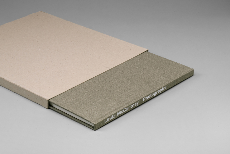
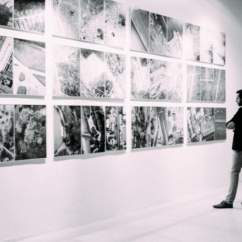
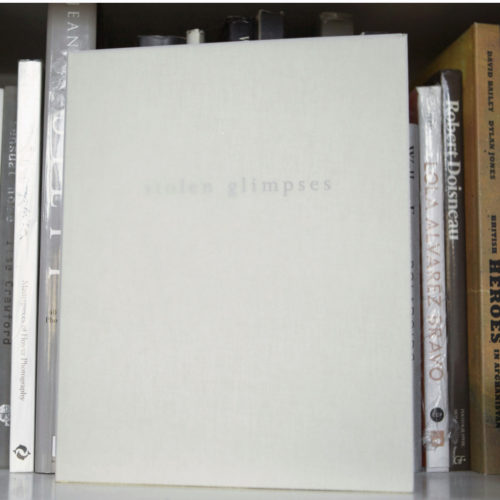
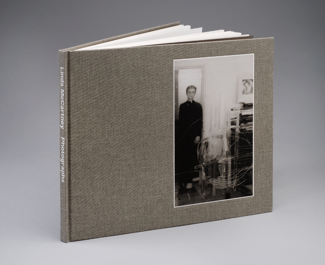
So when I was asked to reproduce an exhibition of platinum prints by Linda McCartney, I was well aware of the problems inherent in the process. Making a book is one thing, but making a book that will be compared to the originals in the gallery setting and where the paper is uncoated is quite another.
We started with the originals and these were scanned in RGB. We always scan in RGB as we want the maximum information from the scan. If you scan in greyscale or convert to CMYK, you are allowing the machine to make selections about what information to keep and what to discard. Better to reserve decisions like this to a human!
As I said at the start, the aim is to achieve the deepest, densest black and we decided could best achieve this using four colours – two greys and two blacks.
However, offset litho relies on the attraction (’tack’) of the paper being greater than that of the blanket carrying the ink in the press and if it isn’t you will have ‘refusal’ whereby the ink stays on the press and won’t transfer to the paper. This usually happens when you have more than two or three solid colours printing on top of one another and you are attempting to transfer wet ink to a surface of wet ink. Since this image needed four solid colours to create the super-dense black, refusal was a real problem.
One way to get around this is to print one colour at a time, called ‘wet on dry’. In this way, there’s no refusal because the dry ink accepts fresh wet ink. However, this is slow, expensive and unpredictable because you can’t be certain what it looks like until the final colour.
Instead, we chose another way and, on our four-colour press, we set up all the colours and ran the first sheets. Sure enough, the blacks were poor, but rather than run the work, we simply ensured it was all in register and looking good in all other respects before turning off all the colours bar the skeleton black (this is a slightly surreal version of the image and the densest printing colour) and running the paper through as a single colour work. However, immediately the sheets were run, we wheeled them back to the front of the press and ran them through again, only now with the remaining colours turned on.
It looked stunning, and represented the best results I’ve seen for offset lithographic printing save wet on dry. I suppose, you could say it was Wet, Wet, Wet on dry… although I definitely preferred Wings!
Words: Francis Atterbury