Outline
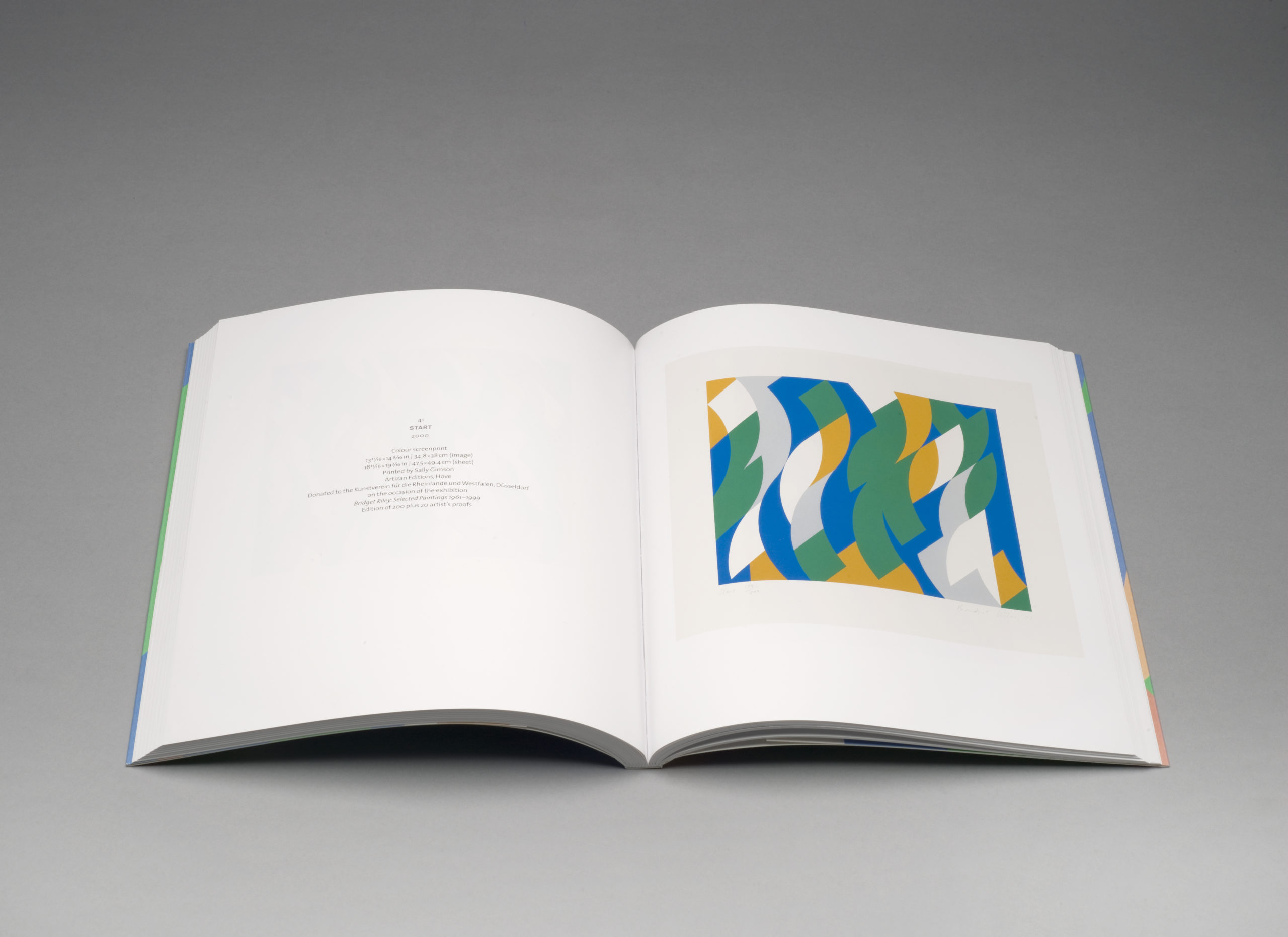
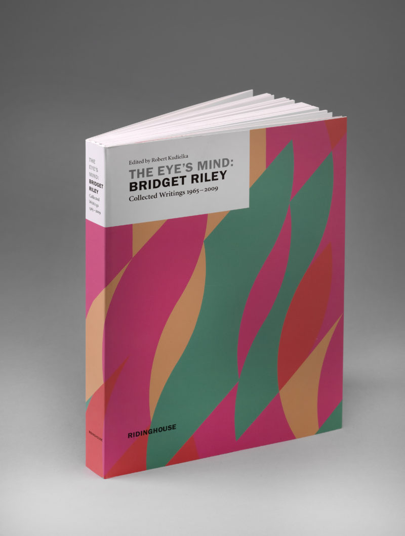
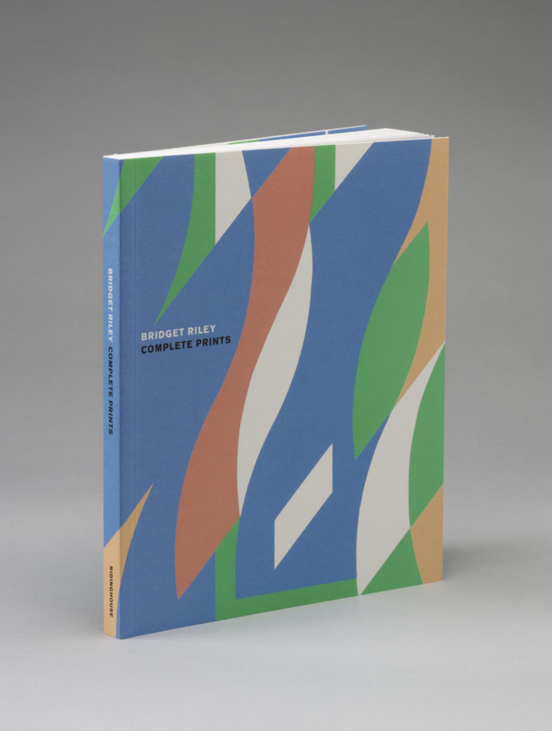
We worked on two of Bridget’s books for the late, and greatly missed, gallerist Karsten Schubert. The first, Eyes Mind was, in many ways, a key moment in the way we thought about colour. I was fortunate enough to work with Bridget on the proofing of the work and, as we talked about the proofs, she told me a little of her approach to colour and, especially, the way the impressionists work. The second book, Complete Prints, was a catalogue of her prints to date.
Of the two titles, I have to confess that Eyes Mind is by far my favourite. The colour issues were the same of course, it was still Bridget’s work after all. But for Eyes Mind, I spent time with Bridget, discussing not just if a colour was correct, but why she had chosen to paint that colour. This insight was fascinating and has influenced how I perceive and reproduce colour. Throw in a good bottle of red wine and a plate of olives and really there’s no competition.
Our Challenge
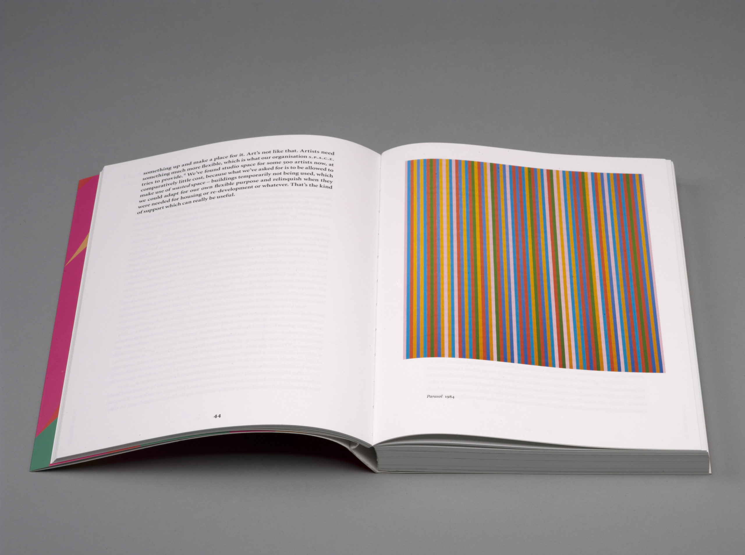
Everything in Bridget’s work comes down to colour and light: and the absence of black in the colour work. As an impressionist, Bridget paints colour without black. Darker shades are achieved by the addition of more colour, not the addition of black. This is the polar opposite of the way Photoshop separates images for the printing process. So, given that our proofs and printed results were being judged by the artist herself, it was essential that we aim for complete accuracy. In addition, both books were soft backs. Personally, I have a real problem with books not opening properly – often an issue with paperback books. So we overcame this challenge by choosing Ota Binding. This is a system that, in effect, binds a soft back as a hardback and, by allowing the spine to float free, enables the book to open flat.
Words: Francis Atterbury