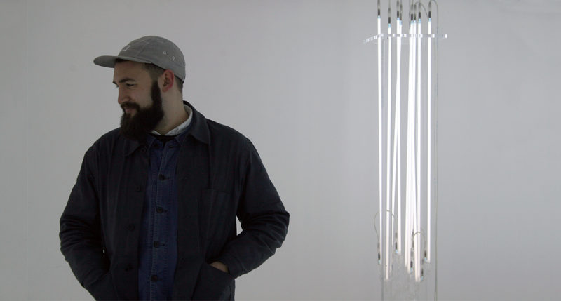
Graphic Designer Joe Carter on a Hurtwood book that blends sculpture with luxury branding and living with a design legacy.
I’ve grown up surrounded by Graphic Design — both my parents are in the industry. My father, Phil Carter, and his business partner Phil Wong were a huge inspiration. Then, since graduating from Kingston University about seven years ago, I’ve been very fortunate to work in a wide variety of London’s most renowned studios and agencies with some real heroes of the industry, such as Tony Brook (of Spin) and Paul Belford (I was the first designer to work for his eponymous studio).
Two years ago, I decided to take my learnings and set up my own studio, with the main aim of utilising every opportunity as a means of consistently creating portfolio-standard work. My practice is based on the formal principals of all good graphic design — great visual ideas combined with the consideration of every possible detail — and applying them to the appropriate media. I’m also obsessed with the processes of production — the way something is made is just as important as the way it looks, and can often influence the outcome of my work.
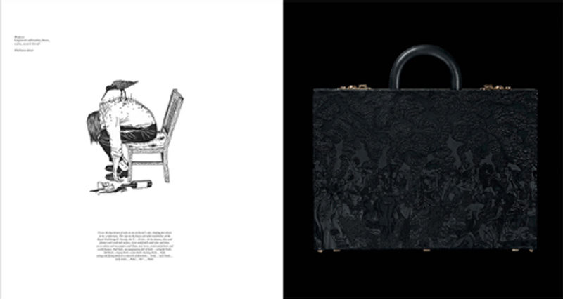
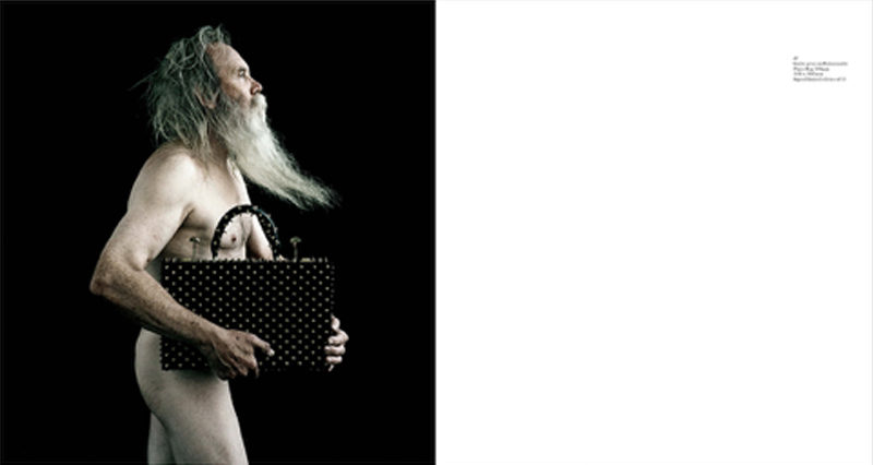
Studio Ruuger are a small team headed by fashion and product designer Oliver Ruuger. They are recognised for their avant-garde, highly labour-intensive luxury objects, which occupy the borderline between sculpture and product, created through distinctive and skilful modern craftsmanship. They have established themselves as one of the UK’s most exciting new luxury labels, selling in London’s most elite boutiques and even appearing in the forthcoming What is Luxury? exhibition at the V&A Museum.
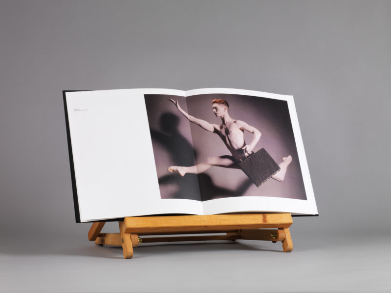
I started working with Oliver to develop a new brand identity in 2013. After having initially developed a logo, look and feel, printed stationery and the branding on the products themselves, we needed a means of presenting their wonderful array of work since their inception in 2011 as an additional brand tool. My brief was to find a way to do this that would do their practice justice.
The book serves as a sort of high-end portfolio, to thrill both commercial buyers, curators and potential new collaborators.
Much like the way I handled the rest of their branded materials, I wanted to achieve subtle, attractive detailing combined with the highest production values, and do so using a mixture of traditional and modern techniques, such as marrying digital printing and hand-binding. This seemed particularly appropriate for a studio that also often juxtapose the old and new, such as creating an umbrella handle using a 3D printer and then hand-covering it with natural leather.
If I’m perfectly honest, I had very little to do with the content of the images themselves. Oliver has always produced extraordinary work, and I guess I’m the lucky one for being able to work with such great content. But this did mean that it was very important for them to be presented cleanly and as large as possible, and printed at the utmost quality.
Well I guess this would usually mean weeks of painstaking repro work, especially what with the book being printed digitally, but thankfully the whole process was handled by Hurtwood. The results are sublime.
It was a combination of two things really. I’d already established the Baskerville typeface as a key component when I developed the Studio Ruuger brand identity in 2013, so it was nice to create some consistency with all of the other printed matter we’d already developed. Add to this one of the font’s greatest features — those remarkable ligatures — and a delicate, almost organic feel to the longer blocks of text was formed. Very much like the unique flourishes in Oliver’s work.
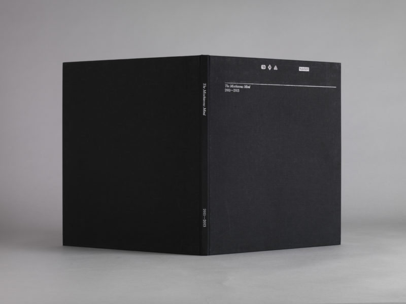
Again, there were a few elements of this which were predetermined by colours and materials we’d used in the past for his stationery, etc. We continued to use a monochrome palette. We’ve only ever blind-debossed the logo, so we continued this on the cover. Also, the Coltskin embossing texture provided by GFSmith’s brilliant Colorplan range (that we used on all the branded stationery) provides a subtle, natural, almost leather-like quality to the endpapers. Considering that most of the studio’s products involve leather in some form, this was an obvious choice. Black cloth and monochrome head and tail bands were the final details that made the book such a luxury object.
Having been told about Hurtwood Press and their Tailored Books a few years ago, I’d been keen to find the right project/client combination to give it a whirl. Also, considering that we didn’t have the budget to produce a huge run of books, but still needed the highest production quality, it seemed a perfect fit.
The ability to make something that exuded luxury in every way for an initial run of only three books.
I thought it was, and still is, stunning. We started with such a high benchmark in terms of the finish we required, so there was real pressure to achieve perfection. Having worked with Francis before, I expected no less, but was still blown away when I unwrapped that first copy.
Initially we only printed three copies — a huge benefit of using Hurtwood was that you specialise in short run printing — so I guess it was a pretty good indication of the book’s success when we found ourselves printing another 15 copies a month later. Apparently even the legendary Karl Lagerfeld now has a copy on his desk.
We’ve plans to make a new edition every couple of years, utilising the same format and production processes. I can’t wait to see the series as a whole one day.
Words: Joe Carter
The Mischievous Mind was entered by Hurtwood for the British Book Design & Production Awards and was Highly Commended in the digitally printed category — where print quality, typography and design are looked at closely.