
Working with great works of art is a huge privilege. But doing justice to the original is our biggest challenge.
In 2016 I visited the exhibition at the Royal Academy in London ‘Painting the Modern Garden: Monet to Matisse’ and, apart from being a deeply satisfying experience, it brought to mind again how hugely enjoyable it is to print these great works.
I have been very fortunate to work up close and personal with the works of two of the artists from the exhibition, Monet and Matisse.
A few years ago, having just completed a book of Joan Miró’s masonite pictures for an exhibition at Art Basel we embarked on two new publications for Helly Nahmad Gallery in London. The gallery specialises in classic modern and post-war art and was mounting an exhibition of Monet to be followed by another on Matisse. Both books were to be designed by the highly creative designer Fernando Guttiérrez.
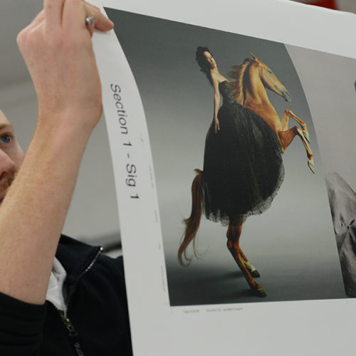
As is usual with work today, the first proofs were made from the digital files and then compared against the originals and colour corrected.
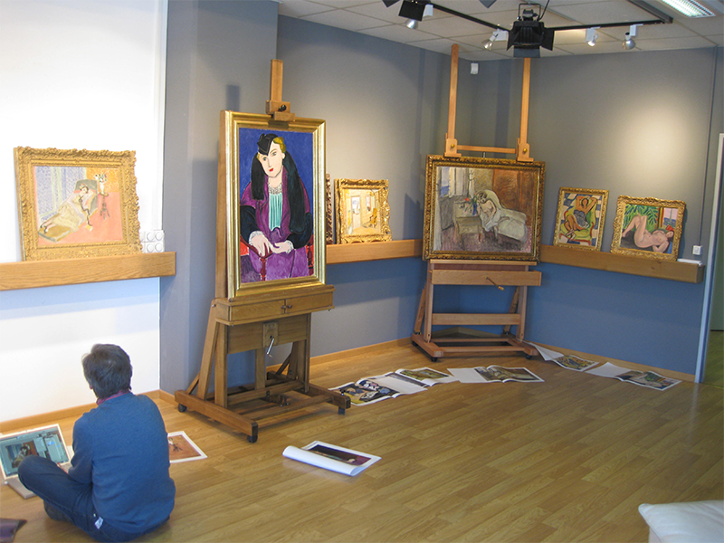
Meeting the original works for the first time is always an exciting and sobering moment. With Monet and Matisse it’s a privilege to be alone in a room with some of the most beautiful and inspiring art ever made with only my notebook and a cup of tea for company. But it’s daunting too because I’m attempting to discern and assess the difference between original and proof and how best to reduce this difference. Also, these are differences not just of colour in an absolute sense, but also of scale. The original painting is usually considerably larger in real life than the printed reproduction and the artist, of course, had any colour they wished at their disposal whereas I am limited to four [we can and do use special inks and non-standard process colours but that’s for a different blog]. We must be able to have confidence in the changes made because from this point we’re on our own. These aren’t the client’s corrections; they’re ours.
One of the greatest impressionists alive and still working today is, of course, Bridget Riley. I made a series of books for Bridget and was lucky enough to be able to talk with her about colour and how we can better reproduce her work in our printing. What became clear is that it’s not really about specific colours but rather the relationships between colours, just as it’s not about placing ink on the paper but rather allowing the light within the work to radiate out.
Once you realise this, colour corrections become relatively simple. You will feel the changes you need. Some specifics are necessary but once you have stopped worrying about what you think you can’t do you will know how to change your proof.
The effect of light, colour and the relationship of colours to each other is demonstrated very clearly in this photo. They are both reproductions of Bridget Riley’s painting Clepsydra (1976) and were both printed by the same company. The one on the left was printed in 2003 and the one on the right in 1978. There are several reasons for the difference but the main one is that the 2003 version forgot about colour ‘differences’ and assumed that the computer must be right and the 1978 version was made by people who knew what they wanted and used their equipment to get it. This is not a ‘lost’ skill (as I hope our books will demonstrate) but you do need to know that it was possible, and that it still is possible. Technology has made it easier in many ways but it’s the people using the technology that’s important, their knowledge, their skill (both taught and innate) and their understanding of colour and its perception. Incidentally, the 2003 book won industry awards for colour reproduction.
If you want to better understand why one image seems alive and the other not, remember that impressionists don’t make colour with black and then take a look at a standard Photoshop separation. But however it’s done, I know which one gives me the right impression.
Words: Francis Atterbury