Graphic artist Billie Temple’s tale of design inspired by fine art, Titania, Lysander, Puck, and the lure of WILD colours.
My original training is in Fine Art, I did a BA at St Martins back when it was still next to Foyles on the Charing Cross Road. I spent three years making fine art videos and installations but these always included design elements and printed matter. As time progressed my passion for paper and print increased. I got into designing album covers for friend’s bands and went on to get my first job in a design agency. I actually started out as a production manager and learnt the ropes from there. Since then I have worked for a variety of extremely interesting people ranging from a fine art taxidermist to an ex-Beatle and on to heritage institutions and large scale corporations. My work is very diverse but I am constantly influenced by my fine art background – the artist Maurizo Cattelan is a source of constant inspiration to me. He publishes an astonishingly exciting magazine called Toiletpaper.
Creativity is at the heart of what I do. Whether I am rebranding a corporate business or illustrating an album sleeve I always try to take the any ideas to the max – really play with them and manipulate all the possible options before reigning it back in again and distilling an concept. This doesn’t mean all my work is a carnival of colour! This process is just as likely to lead to a clean, minimalist approach – it is about what is most appropriate for the task at hand! I enjoy subverting expectations and making sure that all my work has a imaginative edge.
I got to talking with Georgia, a Director of the London Salon, who did the portrait photography within the books, about a project she had on the boil. The concept was series of books featuring portraits of the staff who work at each salons. She was eager for the books to be very imaginative and reflect the creative spirit she had been endeavouring to capture in her photography. Each book was to have it’s own individual personality and theme and she stressed that she wanted them to be unusual and eye-catching.
They are prestige brand items really. They were created to reflect the innovative nature of the salons and to reinforce this with their guests.
They are intended to sit in the waiting area (which are quite luxurious in all the Chapel Salons and where they hold their initial consultations) along side other art and photography books for guests to browse through whilst they wait.
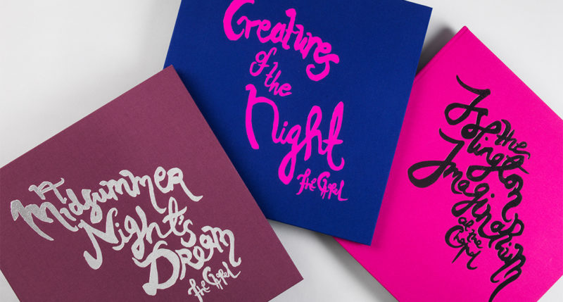
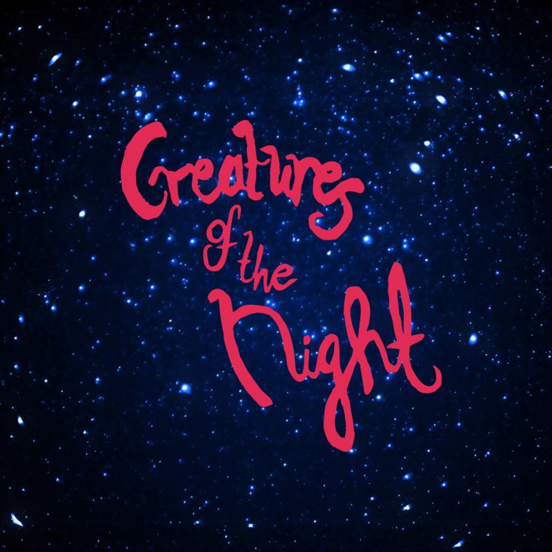
Initially I came up with a theme for each book and ran from there. Georgia had mentioned that she wanted zombies so this very much influenced the theme of the Creatures of the Night book! I then had to decide how much copy, if any, would be in each book and how key words would be to communicating the theme.
For the Creatures of the Night book I wrote a cautionary tales style tale which a short verse for each ‘character’. I decided that I wanted to put all off the portraits into a totally fantasy landscape in pretty much all of the books and wanted to use collage and composite images as the conceit by which to do this. So a lot of sketching, planning and image research ensued. I wanted to make sure there was no repetition across the three books, thus I made clear rules for myself as to the kinds of images and themes in each book.
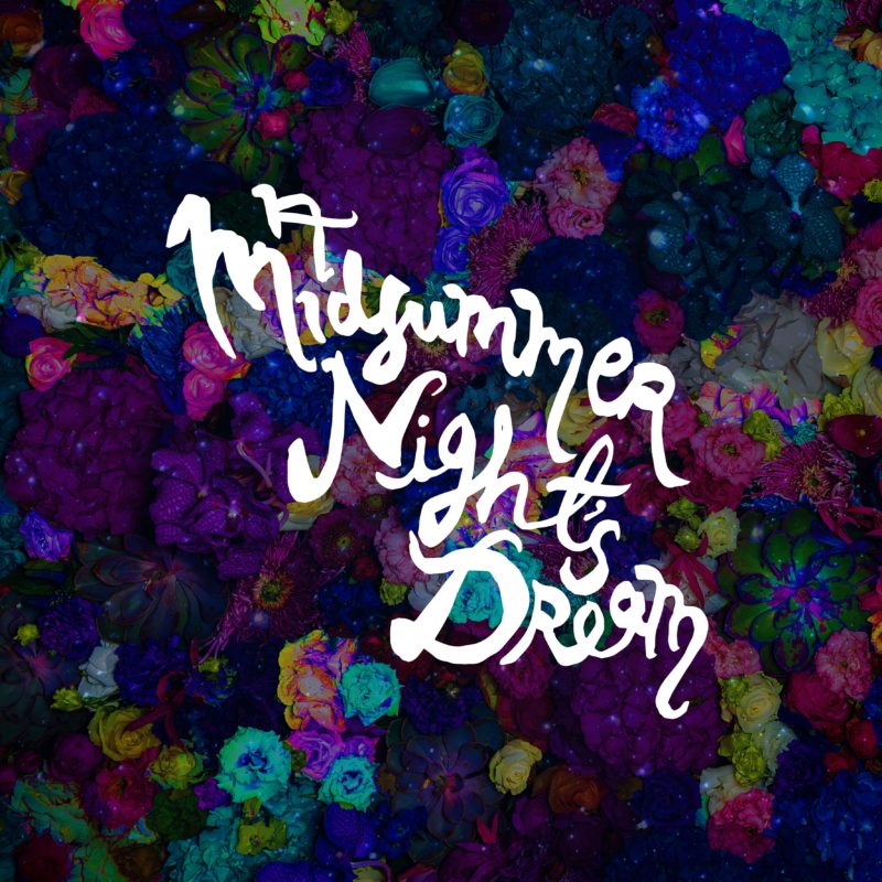
The Midsummer Nights Dream theme was very straightforward conceptually, I love flowers and using images of them in unexpected / unusual ways. They are one of nature’s great excesses and I wanted emphasis that fact, making them kaleidoscopic, jewel like and profuse – almost a protagonist in their own right. I chose to run quotes from the play through the book to hang it all together – I felt that it needed this kind of simplistic structure as some of the pages were going to be quite abstract but there were too many portraits to create a written story for each ‘character’ and not over complicate it. I wanted it to be a visual cascade of flowers and nature along which you are guided by snippets Shakespeare’s verse.
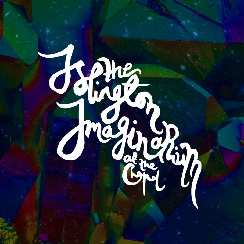
The Islington Imaginarium book required even less copy as each page was to have quite a clear visual story. I wanted the Imaginarium to be an edgy exercise in contemporary pop art and semiotics – using iconoclastic imagery embellished by and set in surreal and prismatic landscapes. Although there are visual themes that link the three books – such as cosmic images and the typography all being hand drawn and stylistically similar. I wanted them to clearly be a set as much as they are thematically individual.
YES! One of the big challenges was trying to make sure that there was light and shade in each book. That they were not all one pitch, that there was visual rhythm which hopefully means that they don’t become samey and dull!
All the typography is hand drawn. I chose to do this to make sure they the sense of individuality and creativity that Georgia had requested was not lost.
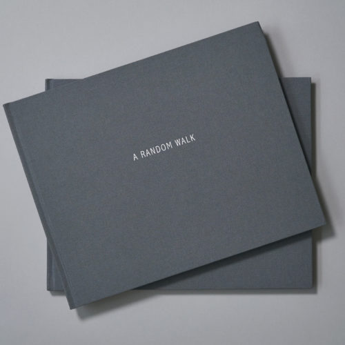
The cloth, blocking and endpapers were selected for each book to reflect the concept and theme of the book in question. It was important that the cloth for each book didn’t clash with the images within and reflected the spirit of each book. However the cloths are very important in making sure that the books sit together nicely as set so I wanted to make sure that they would sit beautifully together if they needed to.
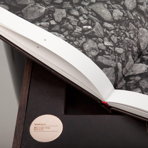
Yes, I think that the books absolutely needed to be section sewn and case bound. To fulfil their intended purpose and give the contents the depth that the client had requested nothing else would cut the mustard!
I honestly don’t know anyone else who could have achieved the astonishingly bright and jewel like colours in these books. They were an incredibly challenging task and my files were a real mix of RGB and CMYK work that needed a seriously expert eye for colour to get the best out of them. They easily could have turned to very upsetting sludge in less experienced hands. I have worked with Hurtwood / Artisan Books for a some time now and hold them in the highest regard, I wouldn’t have entrusted this project to anyone else!
Total and utter delight! They are very beautiful objects and I couldn’t have asked for more!!!!!!
They adored them, they took their breath away! They exceeded their expectations.
Words: Billie Temple