2020 has been a surprising year for most. The whole world paused as the pandemic swept the globe from East to West: an event so profound it left no life untouched. The streets of New York, the city that never sleeps, fell silent. Toilet paper, paracetamol and pasta panic-buying sprees stripped the shelves of local supermarkets, resulting in Waitrose shops across the nation resembling apocalyptic film-sets. Diamanté designer face-masks, Louis-Vuitton visors and haute-couture PPE took off as the fashion industry’s latest craze, a trend even the most astute fashionistas couldn’t have predicted. To say we are living through a defining moment in history would be an understatement.
We asked the Hurtwood team to tell us about their favourite projects in 2020. Starting from the end here’s what they chose.
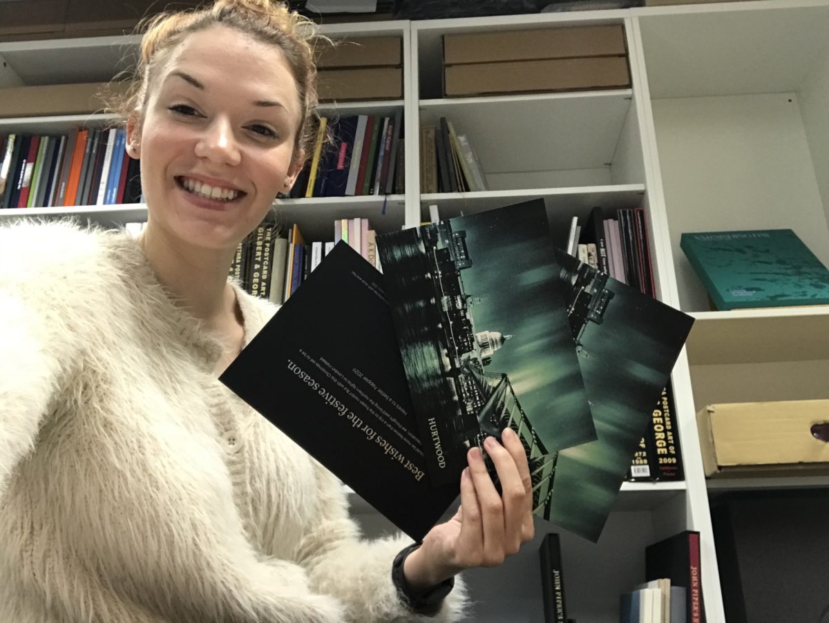
In response to this strange year we decided to do something a bit different for our Christmas card. Like many others around the world right now, the desire to hop on a plane and enjoy a holiday abroad was on our minds this December – a weekend spent enjoying the northern lights in the Scandinavian Arctic Circle was voted the office favourite. So, whilst daydreaming about an escape to Finland we decided to create a ‘northern lights in London’ Christmas card, accompanied by a series of images and GIFFs on social media that capture the northern lights over some of London’s most recognisable landmarks (check out our northern lights in London highlight on our Instagram page). We worked with a luxury Swiss printer who paired iridescent Japanese pigments with innovative silk-screen printing to create our beautiful super-luxe card.
Whilst a festive trip to the frozen north will have to wait until next year, we were pleased to be able to share a bit of Hurtwood pre-press wizardry and bring a touch of Aurora Borealis magic to London this festive season.
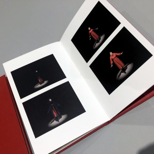
It’s usually very difficult to say which work was my favourite project in any given year. That’s mainly because we become immersed in all our books and, the more you get to know people, the more you tend to like and appreciate their work. However, this has been a year unlike any other and this year I knew immediately. Obviously, it’s ‘Notes from Isolation’.
When the Pandemic hit last February we’d just moved offices from Soho to Vauxhall and we were excitedly looking forward to building on the work and new friends we’d made in 2019. To say we were optimistic wouldn’t be an overstatement. Suddenly, as we all remember, we found ourselves with no work, locked out of our offices and facing a perilous and uncertain future. We were sitting at home, getting to know Zoom and frankly, it would be easy to get a bit down.
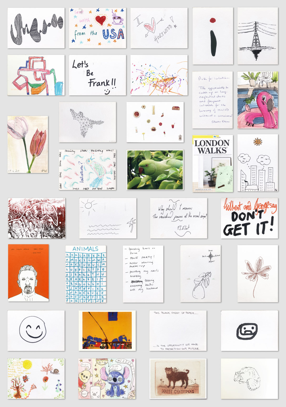
The idea to go ‘Old School’ and use postcards to keep in touch felt very comforting. People talking to people. We decided to send our friends a set of postcards with, what we hoped, were interesting quotes from interesting people about how they coped with loneliness and isolation. We put a blank, addressed card into the pack and asked the recipient to send us back their own postcard from Isolation. Handwriting the addresses reminded me of everyone and the responses were both cheering and inspiring. Confirming to me that we work with wonderful, creative, and thoughtful people. Faced with isolation, it’s easy to forget the joy of being with people. Thanks to the postcards, I’m constantly reminded of our friends. Read the whole story here.

Claudia is a graduate from the Courtauld Institute of Art currently studying for an MA specialising in Modernist Art and Architecture under the Weimar Republic. She writes:
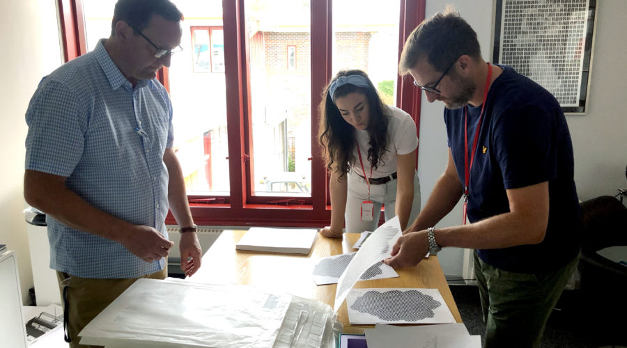
Alongside my studies I got the opportunity to work at Hurtwood on the Varnishing Day portfolio for the Royal Academy of Arts. My first task was to produce a short written piece giving an overview on the Portfolio for the introduction text to go at the top of the box. I was then given access to the database, which was essentially the mothership document used to coordinate the entire project. During this uncertain, strange time, having such a huge project to get my teeth stuck into was a real blessing. Also, being in contact with a hundred different artists (many of whom I had admired since childhood and whose postcard pictures I have on my wall) was a great antidote to the isolation of lockdown. When the lockdown ended, I was able to meet Francis and Roger at the printers and to go through some of the works. Seeing the originals was a bit of a fan-girl moment for me. However, it was not until a few months after when we met, along with the artist David Mach, to print the first batches, that I could see the project in its entirety. Having worked on it exclusively through a computer screen for months, the portfolio, with its stack of 100 prints, finally came alive. See more of this beautiful collection.
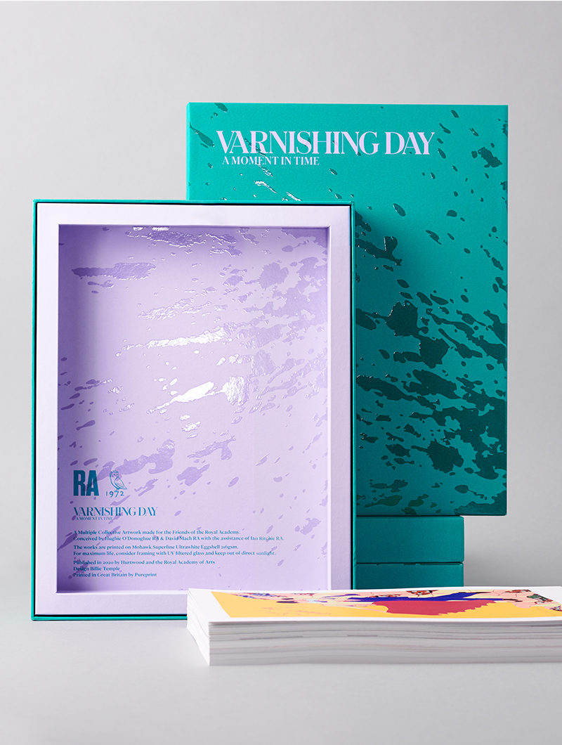

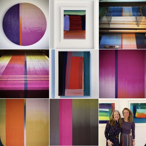
Working on Varnishing Day: A Moment in Time’ with Hurtwood was one of my highlights of 2020. It was an honour to design the complete presentation package for these works housing the collection of some of today’s greatest living artists, and participating in a historic artwork in these unprecedented times. This project is a collective piece and for that reason I didn’t want to single out or elevate any one art form or artist above another. I wanted to create a graphic work for the cover that didn’t feel like it added an additional ‘work’ to the collection so I needed to come up with a concept that felt organic and natural. Thusly the final concept focusses on an action, a moment, something both kinetic and haptic – the varnish splatter across the box, sitting wet on top of the Marrs Green paper as if an artist has just split the varnish intended for their work across the box. The splatter then becomes a deliberate graphic motif throughout the box which along with the use of colour, texture and materiality are both playful and considered. The colour pairing was also incredibly important in realising this design – the bold and contemporary Marrs Green with the heavenly powdery hue of Lavender is intended to be simultaneously joyful and whimsical, serious and surprising.
I considered the use of materials very carefully throughout this project, for example the Marrs Green colorplan on the box exterior has a dapple emboss to help add texture and life to the varnish that sits on top of it, helping it to feel fresher and wetter, the addition of foils to the interior added another dimension and different kind of reflective surface as well as a flourish of luxury. The concept and design were intended to deliver a truly special ‘thank you’ to the friends of the RA and with a design that relied so heavily on materiality the design needed to use the best materials and makers available to fully realise it, which Hurtwood most certainly achieved.
Watch this delightful video from the Royal Academy artists describing the varnishing day project.
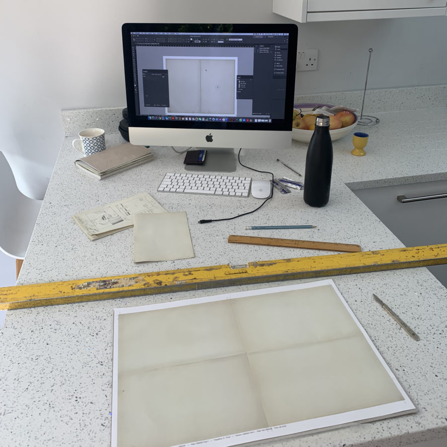
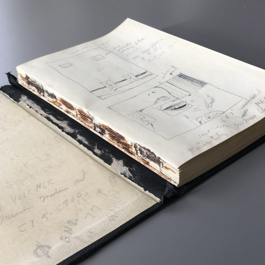
The reproduction of the Rosenquist sketchbook was pretty much completely created in lockdown. The brief was to create a copy of the artist James Rosenquist’s notebook, which would look and feel like the original and could be displayed and enjoyed whilst the original (which is very delicate) can be preserved.
The job had to be split into many stages. Galerie Thaddaeus Ropac in London had introduced us to the Rosenquist Estate and commissioned the work so the first thing to do was to visit the gallery and quickly photograph each page with our phone cameras. This was so I could work out the pagination of the book and record all of the folds and tears in the notebook, making notes to help with binding and the general reproduction. A low resolution layout was created and, from this, I could work out where new professional photography was needed and arrange for this to be carried out. Paper choice is crucial and we needed a paper with precisely the right ‘snap’. A chance meeting just prior to lockdown with GF Smith found us just what we needed! With a paper now in the running we talked to our print partners at Pureprint to feedback on the project via zoom calls.
The next stage was to retouch the colours and add bleed onto every page (284 in total) followed by more colour correction to match the backgrounds to the original. This was by far the most time consuming area, but with a few proof runs to ensure the colour was ok I was off! A few Zoom calls with Ludlow Bookbinders – sharing pictures of the covers and going through all the blemishes, marks and scratches that would need to be recreated and we were ready to go to print. An extra set of sheets arrived at my house and from here I created a maquette which included all the tears, folds and rips that were on the original. A week later Copy Zero arrived and I was blown away at how old it looked. A trip to compare against the original was quickly arranged and from here one slight overall colour shift was needed before the final book was created and delivered to the client in New York.
The best compliment I had was that people had to ask which was the original and which was the new original. Read more about this amazing project here.
Words: the Hurtwood team.